Netflix update brings redesigned controls on Android for more information
Netflix update brings redesigned controls on Android
31 MAY 2018
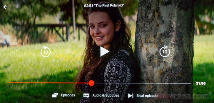
Netflix has updated its Android app with redesigned controls for easier navigation.
The update brings larger more prominent controls next to the play/pause button to skip ten seconds back and ahead. These buttons are now placed right in the center of the screen. Alternatively, users can double tap on the screen on either side to achieve the same result, just like in the YouTube app.

The bottom of the screen also features a new row of keys, with the buttons to see the list of episodes and audio settings now moved down from top right. Netflix has also added a button that lets you directly skip to the next episode with one tap. The top right corner of the display now only contains the button to cast the video.
Finally, if you can now make the video fullscreen by pinching out the video, again, just like in the YouTube app.
The changes are yet to show up on iOS app, which still has the same old UI.
Comments
Post a Comment